How to Use This Book
Structure of the Book
The book’s chapters follow pretty closely the actual set of steps that need to be accomplished before data can be visualized, from the design of the survey to the collection of the data to ultimately its visualization. Really pretty simple. So if you’re fairly new to the game, it is probably going to make sense for you to start at the beginning and read the whole way through the book. Likewise, if you’re familiar with some of the content, but not everything, there’s no harm in just skipping to the chapters that are relevant to your case: you aren’t going to be scrambling to catch up if you skip around!
If you don’t have much (or any) experience with survey design and data collection and visualization, it would probably be best to read this book all the way through before you start collecting your data. Some of the visualizations you want to make when everything is said and done might require some well-planned decisions up front. If you’re reading this book part-by-part as you go, there’s a better chance that you might consider something until it’s too late!
Common Terms and Definitions
Throughout the book, there may be times when we introduce specialized terms and phrases that are rather specific to the topic being discussed. Whenever this is the case, we will provide a link to the term in our glossary. You’re welcome to reference this at any time, but we do our best to point you in that direction when a new term is used.
Advanced Chapters
This book does contain some chapters that go a bit above and beyond just the basics that we think you should know. We do denote these chapters with a warning at the beginning of the chapter so that you know to expect a more in-depth look at the topic. Reading these chapters (although we recommend it!) is not necessary for an adequate understanding of the broader topic being discussed; however, there are times when we feel that it’s useful to provide you with easy access to the information and that you could benefit from a more thorough understanding of the topic.
Examples: The Good, the Bad, and the Ugly
One of our favorite parts about this book (although maybe we’re a little biased) is the examples that we use throughout: many of these concepts can get kind of abstract and having a concrete example to refer to really helps to keep things straight. That said, there are a few different styles that we use to indicate good and bad examples, dos and don’ts, etc.
| Question | Answer |
|---|---|
| What are we hoping to find? | The answer lives here. |
Good Examples
Good examples are always accompanied by a green or blue bar, a checkmark, or a thumbs-up symbol, depending on what’s being presented (a graphic, a data table, a procedure, something else). Throughout the book, these will look like:
Bad Examples
Conversely, whenever we illustrate what not to do in a given situation, we will include a gray bar or cross out the example with a large X or include a thumbs-down symbol to accompany it. These different styles will look like:
| Pros | Cons |
|---|---|
| The benefits of an action go here. | And the negatives go here. |
| Do | Don’t |
|---|---|
| This column lists good tips and advice. | This column shows what you should avoid. |
Sometimes we also mark good and bad examples using images
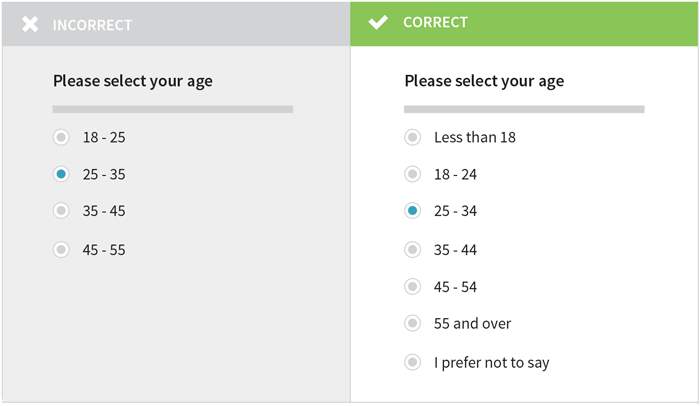
An image preceded by a gray box with an “x” means that it’s a graphical example of a practice that you should avoid.
This is an example of what not to do
Warnings
Other times, we will just want to make sure that you’re careful and don’t forget to consider an important point. When this is the case we will include a warning box, identified by a red exclamation mark. (Actually, we already used one of these up above!)
Making Contributions and Corrections
If you’re reading through the book and notice a typo, or think that something is incorrectly or ambiguously explained, or get a great idea for a new section or chapter, let us know! There are two ways to do this: you can either fill out this form or, if you’re a little bit more technical, follow the directions that we have on GitHub.
Likewise, if you just aren’t sure about something after reading about it, ask us for a better explanation! It’s likely that we didn’t realize that we could have explained it better (but that doesn’t mean we don’t want to!). Tweet us at @DataDesignBook, email ebook@infoactive.co, or check out HelpMeViz for even more resources. We’ll do our best to get your question squared away and will make sure that future editions do a better job addressing the issue.