
Chapter 14
Anatomy of a Graphic
By Amanda Makulec
Once you’ve built a draft of your chart, the next step in creating an impactful visualization is making sure all of its elements are labeled appropriately. The text components of a graph give your reader visual clues that help your data tell a story and should allow your graph to stand alone, outside of any supporting narrative.
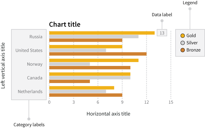
Let’s make sure a few terms are totally clear up front. When we’re talking about data labels, category labels, axis labels, and other pieces of text on your graph or chart, we’re generally referring to what is mapped out in Figure 1.
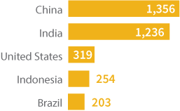
One of the most impactful ways to show the value added by text labels is by showing the same visualization with and without these labels. Let’s take these two graphs showing the number of Olympic medals won by country at the Sochi Winter Olympics in 2014.
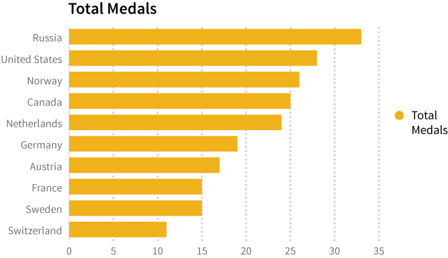
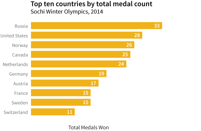
Both graphs display the same data (and show how home team Russia ran away with the medal count!). The first has the default text generated by Excel, giving limited information to the reader, while the texted added in the second shows how smart use of simple text can help your data tell a story.
In Figure 2, the simple addition of different text clues helps the reader understand what he or she is reading. Check out the the chart title, axis labels, legend, and data labels. Each of these pieces of information is an opportunity to help your reader understand the message you want to share through your graph.
As important as text can be to help you tell your story, it uses prime real estate and should be as simple and direct as possible. Over-labeling axes or data points, or writing excessively long chart titles, is a quick way to clutter your visualization and reduce its impact. Graphs that pack a punch are often elegant in their simplicity. With the electronic tools we have for developing graphs and charts, changes can be made with the click of a button and a few keystrokes, so don’t be afraid to experiment with your labels to help you strike this balance! Try adding different labels, editing them, and then taking them away as needed until you find the right balance to most effectively communicate your message.
In most cases, you want a chart or graph to be able to stand alone, outside of any narrative text. Sometimes that means tacking on explanatory text to clearly articulate your message. This could be written as a caption above or beneath the graph to clearly articulate your message to a specific audience. For the sake of simplicity, we’ll focus here on the essential labels and legends within your graph, rather than crafting additional explanations.
Clear and Relevant Axes
Let’s be clear about a couple of terms up front so there’s no confusion about how we’re using them: category labels are the ticks and categories along the axis that identify the data. Axis titles are the short text titles included along an axis to identify what variable is being displayed. Refer back to Figure 1 for a quick reference if you need to!
You should use axis titles to give your reader a summary description of the variable you’re displaying. Depending on the data you’re working with, you may have extremely long and descriptive names for each of your variables (if someone built your data table and added lots qualifying information), or very short, abbreviated variable names (as is often the case with machine-readable data). What you write along your horizontal and vertical axes should start with the axis title and be followed by the units you’re using to display information (percent, dollars, etc.). The axis titles remind your reader what information you’re sharing with them and help limit confusion about the units.
Labeling Categories and Axes
It’s important to find a balance between giving enough information to your audience and keeping your text simple. Make sure you include enough information to explain the data you’re presenting while keeping the text simple enough so it doesn’t clutter the graph.
In our Olympic medal example, the horizontal axis shows the number of medals won at the Sochi 2014 Olympic Winter games. When creating a graph, it’s common to go through a couple of iterations of the axis labels and chart titles. Once you’ve picked an axis title, think about how your reader could interpret that information. An axis title of “Medals” seems straightforward enough, but what exactly do we mean? Medals won? Medals lost? Medals won in 2014 alone? Medals won in any winter Olympic games? Your chart title can help clarify these questions, and your axis title also gives you the opportunity to tell your story.
Instead of Medals, let’s title the horizontal axis with “Total Olympic Medals Won (2014).” Using the word “total” ensures the reader knows you’re talking about all medals, not only one kind (gold, silver, or bronze) or from one event. “Olympic” ensures your reader knows that you’ve shared only the Olympic medals, not a total of Olympic and Paralympic medals for the same year. And finally, “2014” reminds your reader in what year the medals were won. Alternately, as we’ve shown here, you can include some of those details in the chart title, which we’ll talk about later in this chapter.
Units
When we refer to units, we’re talking about things like “percentages”, “dollars”, “millions”, or other descriptors that make sure your reader knows what kind of information you’re displaying. These are important if you’re sharing data that are in percents instead of counts or if a multiplier has been used (for example, millions of dollars instead of just dollars).
It’s important to be clear in labeling your units. Some quick checks to walk through when you’re assessing your axis titles:
- Make sure you’re consistent if you’re displaying multiple types of data using a dual axis graph: you don’t want to display two variables with one in months and a second in years on the same axis!
- Instead of using abbreviations or acronyms, write out the full unit (for example, millimeters instead of mm).
- Symbols can sometimes be a helpful alternative to words in text, but make sure to clearly state what a symbol represents. For example, you could use “$” instead of the word “dollar.” However, this symbol is used with the currency of more than 30 countries, so you should specify which country’s currency you mean (e.g. US$, A$, Mex$).
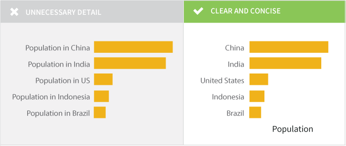
There are occasions where, for the sake of visual simplicity, you can get away with omitting the axis title if the categories you’re sharing are self explanatory. In our Olympic medal graph, we’ve listed the country names along the vertical axis. If you’re confident your audience will be able to recognize that the fields listed are countries, there’s no need to over complicate the graph by adding an axis title that says, “Country.” If you have any doubt about your audience’s knowledge of your categories, err on the side of caution and label your axes.
Position and Format
Horizontal axis titles should be aligned parallel to the axis labels. Format them in a font size large enough to read, but not so large that it dominates the graph.
There’s some debate over whether or not vertical axis labels should be aligned parallel to the axis or not. On the one hand, aligning the text vertically makes it very clear that it’s directly associated with the vertical axis. There’s often more room to write the axis title text if it’s rotated at a 90-degree angle. On the other hand, humans are not very good at reading vertical text, and readers may find themselves squinting and turning their heads to understand the chart. If you have enough room and the axis title text is short, consider keeping the text level instead of rotating it. We’ve also included two examples below that show what to avoid when placing your vertical axis titles.
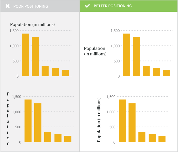
Individual category labels should be clearly marked too. Make sure any words and numbers are easy to read: your reader should not have to play contortionist games with his or her neck to get a good look at what you’re trying to share in your graph. A few tricks for formatting your axis labels:
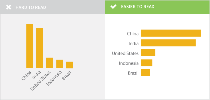
- Where possible, avoid rotating text on an angle, which is often used in vertical bar charts to force long text labels to fit but is difficult to read. If you find yourself with a horizontal axis using rotated, dense labels, try changing your chart type to a horizontal bar which will make the labels easier to read.
- Simplify your labels. Even if your data werer originally formatted with long strings of text for each category you’re trying to display, think about what you can simplify without losing meaning.
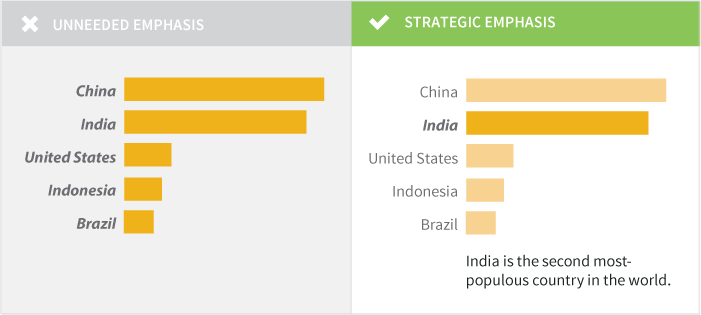
- Use boldface text and italics sparingly and only where they have meaning. For example, you might use boldface for a category label for a data point you’re highlighting.
Labeling Your Data
To label or not to label, that is the question. A data label is most commonly added as the data value associated with a bar or point on a graph. When you want to make sure your audience has access to the precise data points, adding data labels works well. What labels to add, if any, depend on your audience and the story you’re trying to tell with your chart or graph. Labels can add detail and value to your visualization, but can just as easily clutter it and confuse your reader.
You don’t have to limit your data labels to the data values themselves, though the numeric values are the most common ones added. Instead, you can label the bars/dots/etc. to highlight specific pieces of information with a text description where appropriate. For example, if you’re creating a complex chart that shows the number of Olympic medals won by a country over the past 50 years you may want to label the year with the highest total as “most medals” to help it jump out for the reader for its value (and not just the raw number).
When deciding how you can use data labels to create impact, think about your audience. Do they need to know the precise numbers you’re displaying on your chart? Are you trying to show a trend? Are you using a graph to help your audience easily see highs and lows? Depending on what information your audience needs, you could choose one of three approaches towards labels.
Option 1: Label Every Point
Data labels for every point ensure your reader can easily read the precise value of each data point. On bar and column charts, this also eliminates the need for grid lines. Color and position are important to consider when adding all of these values to the graph. For bar charts or pie charts, placing the labels inside the bars can help the reader quickly identify the important information. On a bar chart, you can place the data label on the inside or the outside of the bar. Placing the label inside the bar often makes it more clear where the bar ends, and reduces the chance that the reader will misinterpret the data.
Labeling each point can provide detailed information, but also make your graph look messy when you have a large number of fields. Scatterplots are a great example of a graph type that typically looks messy with all data points labeled, particularly if the labels are text (country names) like in Figure 4. So many labels! So much overlap! So…hard to read.
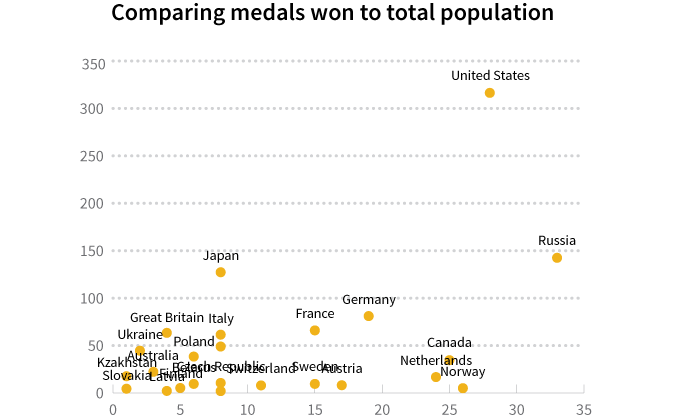
Determine if your reader really needs to know each precise value or if you’re trying to show trends, highs, or lows, in which case move onto Option 2.
Option 2: Label the Data You Want to Highlight
When you’re trying to emphasize how specific data points compare to others (for example, highlighting the data from one country across many in the same region) or emphasizing the high and low values, having selective data labels can guide your reader. Here are two examples for different audiences.
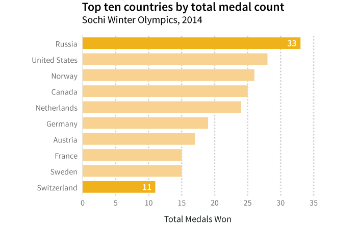
If your audience is interested in the range of values for number of medals won by the top ten countries, label the high and low values. By highlighting the highest and lowest values, you establish the range of the values. Additionally formatting the choices, like making the high and low bars different colors, also calls out these values.
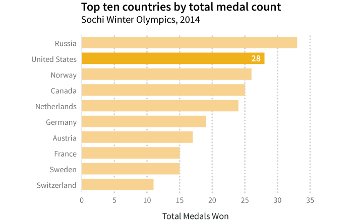
If your audience is from one specific country and wants to see how their medal wins compare to the other top ten countries’ medal totals, highlight and provide the data point for the single county (for example, the United States).
Option 3: No Data Labels
We often build graphs to simplify the visual presentation of information. If you can effectively convey your message without complicating your visual with extra labels and text, just say no to adding data labels. Reserve the use of labels for the occasions when you need that level of detail: make your default to be no labels and then add as needed.
Because of the way that the human brain interprets angles and area, it can be tough to visually assess the values associated with slices of pie charts. For that reason, it’s a good idea to add data labels to pie charts for clarity.
Simple and Powerful Legends
A legend ensures that your reader knows what your graph’s colors or patterns mean. When you’re only showing one kind of data where color or pattern doesn’t carry any special meaning, you don’t need a legend (as in the earlier bar charts, only showing total medal count). If you have multiple kinds of data represented on your graph or chart, a legend is essential.
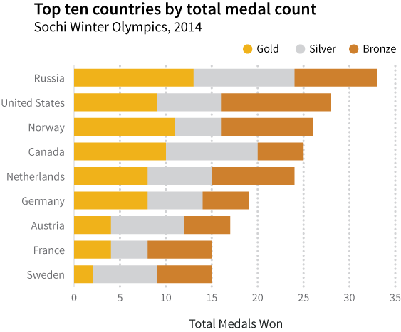
Say that instead of showing total medal count, you want to show the total count broken down by medal types (gold, silver, and bronze). You could include them all one bar chart with a different color to represent each medal type.
Here, each color represents a single medal type and is clearly defined in the legend on the top of the graph. Consider how your reader will look at your graph: obscuring the legend in a corner can make it difficult to find quickly, while laying it over white space on the chart (for example, where there are short bars) can be distracting.
This graph is a great example of the importance of position for the legend. By aligning the legend along the top of the bar chart, it’s easy to visually place which color aligns with which data category. While the placement of the legend is partially an aesthetic choice, its placement can visually assist your reader in interpreting your graph.
Concise but Impactful Titles
At last! You’ve labeled your axes. You’ve added (or decided not to add) data labels. You’ve ensured that the categories or values along your axes are clear. Now comes the opportunity to tell your story in 1-2 lines of text: your chart title. The title should succinctly tell your reader what message this graph or chart has been designed to convey. It doesn’t have to be a complete sentence, but it should be free of complicated language and syntax.
It’s important to think about who your audience is and where your graph is going to be published when writing your chart title: are you a journalist adding the chart to an article, a blogger creating a very visual post, or perhaps a scientist going for a peer-reviewed publication? Scientists may need to clearly articulate the relationship displayed between their variables whereas a journalist may want to give some spin to the title to emphasize the message they want to share.
The most basic graph titles clearly state the relationship between the independent variable on the horizontal axis and the dependent variable on the vertical axis. For example, we called our medal count graph, “Top Ten Countries by Medal Count, Sochi Winter Olympics 2014.” This title tells that reader that we’re looking at the total medals won (medal count) by country, limited to the top ten winners at the Sochi Winter Olympic Games in 2014. Each element of the chart title we’ve created adds value and tells something to the reader. There’s nothing wrong with titles like these: while somewhat dry, they’re straightforward and clearly tell your reader what is on the graph.
You can also approach a title as an opportunity to state the conclusion your reader should draw from your graph. For example, take where we highlighted the US medal count. If you want to highlight the US ranking second in overall medal count, you could title the graph, “US ranks second for total medals won, Sochi Winter Olympics 2014.” Often you see these leading titles in newspapers and other publications telling a specific story. The chart title provides an extra opportunity to emphasize and amplify your message—use it!
Looking for Feedback
One of the best ways to see if your chart or graph clearly communicates your message is to ask an impartial party to take a look. This is the time to call in that favor and ask a friend or colleague for five minutes and some honest feedback. Ask your reviewer to identify if there’s any information they feel is missing. Remember not to take it personally if there are edits that need to happen; the best charts and graphs happen through multiple drafts and with the help of collaborators.
The contributors for this book have also set up a group to give you feedback on your visualizations. If you’re looking for honest feedback from an impartial party, HelpMeViz is a community feedback site that can help.
This final check is a great way to make sure you’ve provided enough detail in your axis labels, axis titles, chart title, and legend. If some thoughtful changes are suggested, go back to the file and make a few edits: it will be time well spent, and at the end of the day your visualization will be better for it!