
Chapter 2
About Data Aggregation
By Alistair Croll
When trying to turn data into information, the data you start with matter a lot. Data can be simple factoids—of which someone else has done all of the analysis—or raw transactions, where the exploration is left entirely to the user.

| Level of Aggregation | Number of metrics | Description |
|---|---|---|
| Factoid | Maximum context | Single data point; No drill-down |
| Series | One metric, across an axis | Can compare rate of change |
| Multiseries | Several metrics, common axis | Can compare rate of change, correlation between metrics |
| Summable multiseries | Several metrics, common axis | Can compare rate of change, correlation between metrics; Can compare percentages to whole |
| Summary records | One record for each item in a series; Metrics in other series have been aggregated somehow | Items can be compared |
| Individual transactions | One record per instance | No aggregation or combination; Maximum drill-down |
Most datasets fall somewhere in the middle of these levels of aggregation. If we know what kind of data we have to begin with, we can greatly simplify the task of correctly visualizing them the first time around.
Let’s look at these types of aggregation one by one, using the example of coffee consumption. Let’s assume a café tracks each cup of coffee sold and records two pieces of information about the sale: the gender of the buyer and the kind of coffee (regular, decaf, or mocha).
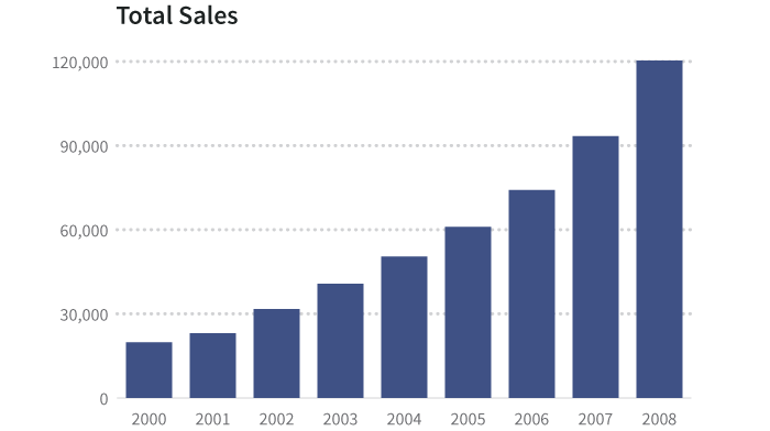
The basic table of these data, by year, looks like this1:
| Year | 2000 | 2001 | 2002 | 2003 | 2004 | 2005 | 2006 | 2007 | 2008 |
|---|---|---|---|---|---|---|---|---|---|
| Total sales | 19,795 | 23,005 | 31,711 | 40,728 | 50,440 | 60,953 | 74,143 | 93,321 | 120,312 |
| Male | 12,534 | 16,452 | 19,362 | 24,726 | 28,567 | 31,110 | 39,001 | 48,710 | 61,291 |
| Female | 7,261 | 6,553 | 12,349 | 16,002 | 21,873 | 29,843 | 35,142 | 44,611 | 59,021 |
| Regular | 9,929 | 14,021 | 17,364 | 20,035 | 27,854 | 34,201 | 36,472 | 52,012 | 60,362 |
| Decaf | 6,744 | 6,833 | 10,201 | 13,462 | 17,033 | 19,921 | 21,094 | 23,716 | 38,657 |
| Mocha | 3,122 | 2,151 | 4,146 | 7,231 | 5,553 | 6,831 | 16,577 | 17,593 | 21,293 |
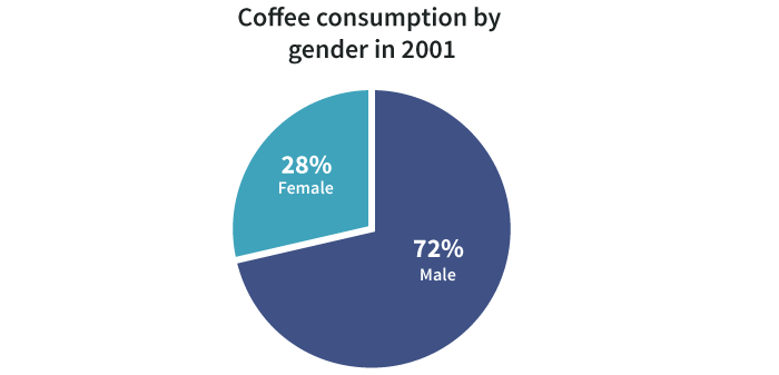
Factoid
A factoid is a piece of trivia. It is calculated from source data, but chosen to emphasize a particular point.
Example: 36.7% of coffee in 2000 was consumed by women.
Series
This is one type of information (the dependent variable) compared to another (the independent variable). Often, the independent variable is time.
| Year | 2000 | 2001 | 2002 | 2003 |
|---|---|---|---|---|
| Total sales | 19,795 | 23,005 | 31,711 | 40,728 |
In this example, the total sales of coffee depends on the year. That is, the year is independent (“pick a year, any year”) and the sales is dependent (“based on that year, the consumption is 23,005 cups”).
A series can also be some other set of continuous data, such as temperature. Consider this table that shows how long it takes for an adult to sustain a first-degree burn from hot water. Here, water temperature is the independent variable2:
| Water Temp °C (°F) | Time for 1st Degree Burn |
|---|---|
| 46.7 (116) | 35 minutes |
| 50 (122) | 1 minute |
| 55 (131) | 5 seconds |
| 60 (140) | 2 seconds |
| 65 (149) | 1 second |
| 67.8 (154) | Instantaneous |
And it can be a series of non-contiguous, but related, information in a category, such as major car brands, types of dog, vegetables, or the mass of planets in the solar system3:
| Planet | Mass relative to earth |
|---|---|
| Mercury | 0.0553 |
| Venus | 0.815 |
| Earth | 1 |
| Mars | 0.107 |
| Jupiter | 317.8 |
| Saturn | 95.2 |
| Uranus | 14.5 |
| Neptune | 17.1 |
In many cases, series data have one and only one dependent variable for each independent variable. In other words, there is only one number for coffee consumption for each year on record. This is usually displayed as a bar, time series, or column graph.
In cases where there are several dependent variables for each independent one, we often show the information as a scatterplot or heat map, or do some kind of processing (such as an average) to simplify what’s shown. We’ll come back to this in the section below, Using visualization to reveal underlying variance.
Multiseries
A multiseries dataset has several pieces of dependent information and one piece of independent information. Here are the data about exposure to hot water from before, with additional data4:
| Water Temp °C (°F) | Time for 1st Degree Burn | Time for 2nd & 3rd Degree Burns |
|---|---|---|
| 46.7 (116) | 35 minutes | 45 minutes |
| 50 (122) | 1 minute | 5 minutes |
| 55 (131) | 5 seconds | 25 seconds |
| 60 (140) | 2 seconds | 5 seconds |
| 65 (149) | 1 second | 2 seconds |
| 67.8 (154) | Instantaneous | 1 second |
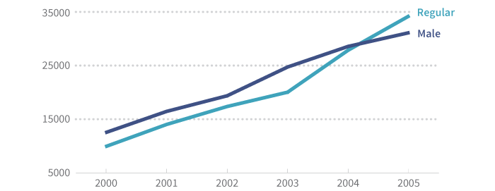
Or, returning to our coffee example, we might have several series:
| Year | 2000 | 2001 | 2002 | 2003 | 2004 | 2005 |
|---|---|---|---|---|---|---|
| Male | 12,534 | 16,452 | 19,362 | 24,726 | 28,567 | 31,110 |
| Regular | 9,929 | 14,021 | 17,364 | 20,035 | 27,854 | 34,201 |
With this dataset, we know several things about 2001. We know that 16,452 cups were served to men and that 14,021 cups served were regular coffee (with caffeine, cream or milk, and sugar).
We don’t, however, know how to combine these in useful ways: they aren’t related. We can’t tell what percentage of regular coffee was sold to men or how many cups were served to women.
In other words, multiseries data are simply several series on one chart or table. We can show them together, but we can’t meaningfully stack or combine them.
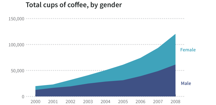
Summable Multiseries
As the name suggests, a summable multiseries is a particular statistic (gender, type of coffee) segmented into subgroups.
| Year | 2000 | 2001 | 2002 | 2003 | 2004 | 2005 | 2006 | 2007 | 2008 |
|---|---|---|---|---|---|---|---|---|---|
| Male | 12534 | 16452 | 19362 | 24726 | 28567 | 31110 | 39001 | 48710 | 61291 |
| Female | 7261 | 6553 | 12349 | 16002 | 21873 | 29843 | 35142 | 44611 | 59021 |
Because we know a coffee drinker is either male or female, we can add these together to make broader observations about total consumption. For one thing, we can display percentages.
Additionally, we can stack segments to reveal a whole:
One challenge with summable multiseries data is knowing which series go together. Consider the following:
| Year | 2000 | 2001 | 2002 | 2003 | 2004 |
|---|---|---|---|---|---|
| Male | 12534 | 16452 | 19362 | 24726 | 28567 |
| Female | 7261 | 6553 | 12349 | 16002 | 21873 |
| Regular | 9929 | 14021 | 17364 | 20035 | 27854 |
| Decaf | 6744 | 6833 | 10201 | 13462 | 17033 |
| Mocha | 3122 | 2151 | 4146 | 7231 | 5553 |
There is nothing inherent in these data that tells us how we can combine information. It takes human understanding of data categories to know that Male + Female = a complete set and Regular + Decaf + Mocha = a complete set. Without this knowledge, we can’t combine the data, or worse, we might combine it incorrectly.
It’s Hard to Explore Summarized Data
Even if we know the meaning of these data and realize they are two separate multiseries tables (one on gender and one on coffee type) we can’t explore them deeply. For example, we can’t find out how many women drank regular coffee in 2000.
This is a common (and important) mistake. Many people are tempted to say:
- 36.7% of cups sold in 2000 were sold to women.
- And there were 9,929 cups of regular sold in 2000.
- Therefore, 3,642.5 cups of regular were sold to women.
But this is wrong. This type of inference can only be made when you know that one category (coffee type) is evenly distributed across another (gender). The fact that the result isn’t even a whole number reminds us not to do this, as nobody was served a half cup.
The only way to truly explore the data and ask new questions (such as “How many cups of regular were sold to women in 2000?”) is to have the raw data. And then it’s a matter of knowing how to aggregate them appropriately.
Summary Records
The following table of summary records looks like the kind of data a point-of-sale system at a café might generate. It includes a column of categorical information (gender, where there are two possible types) and subtotals for each type of coffee. It also includes the totals by the cup for those types.
| Name | Gender | Regular | Decaf | Mocha | Total |
|---|---|---|---|---|---|
| Bob Smith | M | 2 | 3 | 1 | 6 |
| Jane Doe | F | 4 | 0 | 0 | 4 |
| Dale Cooper | M | 1 | 2 | 4 | 7 |
| Mary Brewer | F | 3 | 1 | 0 | 4 |
| Betty Kona | F | 1 | 0 | 0 | 1 |
| John Java | M | 2 | 1 | 3 | 6 |
| Bill Bean | M | 3 | 1 | 0 | 4 |
| Jake Beatnik | M | 0 | 0 | 1 | 1 |
| Totals | 5M, 3F | 16 | 8 | 9 | 33 |
This kind of table is familiar to anyone who’s done basic exploration in a tool like Excel. We can do subcalculations:
- There are 5 male drinkers and 3 female drinkers
- There were 16 regulars, 8 decafs, and 9 mochas
- We sold a total of 33 cups
But more importantly, we can combine categories of data to ask more exploratory questions. For example: Do women prefer a certain kind of coffee? This is the kind of thing Excel, well, excels at, and it’s often done using a tool called a Pivot Table.
Here’s a table looking at the average number of regular, decaf, and mocha cups consumed by male and female patrons:
| Row Labels | Average of Regular | Average of Decaf | Average of Mocha |
|---|---|---|---|
| F | 2.67 | 0.33 | 0.00 |
| M | 2.00 | 1.75 | 2.00 |
| Grand Total | 2.29 | 1.14 | 1.14 |
Looking at this table, we can see a pretty clear trend: Women like regular; men seem evenly split across all three types of coffee5.
The thing about these data, however, is they have still been aggregated somehow. We summarized the data along several dimensions—gender and coffee type—by aggregating them by the name of the patron. While this isn’t the raw data, it’s close.
One good thing about this summarization is that it keeps the dataset fairly small. It also suggests ways in which the data might be explored. It is pretty common to find survey data that looks like this: for example, a Google Form might output this kind of data from a survey that says:
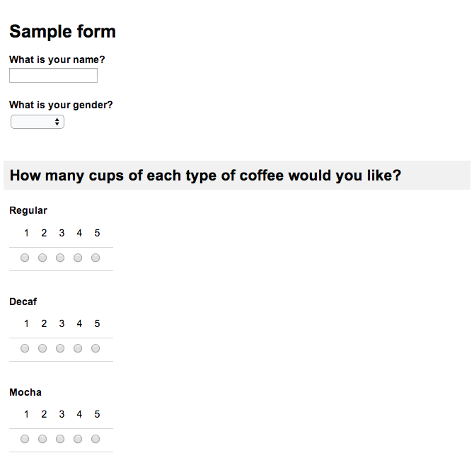
Producing the following data in the Google spreadsheet:
| Timestamp | What is your name? | Gender? | Regular | Decaf | Mocha |
|---|---|---|---|---|---|
| 1/17/2014 11:12:47 | Bob Smith | Male | 4 | 3 |
Using Visualization to Reveal Underlying Variance
When you have summary records or raw data, it’s common to aggregate in order to display them easily. By showing the total coffee consumed (summing up the raw information) or the average number of cups per patron (the mean of the raw information) we make the data easier to understand.
Consider the following transactions:
| Name | Regular | Decaf | Mocha |
|---|---|---|---|
| Bob Smith | 2 | 3 | 1 |
| Jane Doe | 4 | 0 | 0 |
| Dale Cooper | 1 | 2 | 4 |
| Mary Brewer | 3 | 1 | 0 |
| Betty Kona | 1 | 0 | 0 |
| John Java | 2 | 1 | 3 |
| Bill Bean | 3 | 1 | 0 |
| Jake Beatnik | 0 | 0 | 1 |
| Totals | 16 | 8 | 9 |
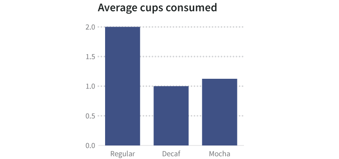
| Averages | 2 | 1 | 1.125 |
We can show the average of each coffee type consumed by cup as a summary graphic:
But averages hide things. Perhaps some people have a single cup of a particular type, and others have many. There are ways to visualize the spread, or variance, of data that indicate the underlying shape of the information, including heat charts, histograms, and scatterplots. When keeping the underlying data, you can wind up with more than one dependent variable for each independent variable.
A better visualization (such as a histogram, which counts how many people fit into each bucket or range of values that made up an average) might reveal that a few people are drinking a lot of coffee, and a large number of people are drinking a small amount.
Consider this histogram of the number of cups per patron. All we did was tally up how many people had one cup, how many had two, how many had three, and so on. Then we plotted how frequently each number occurred, which is why this is called a frequency histogram.
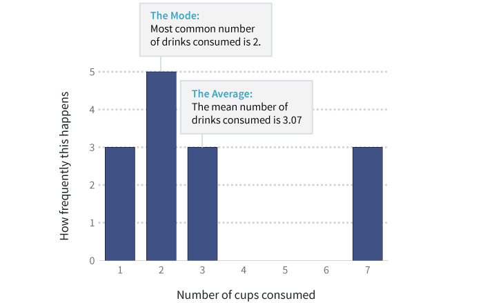
The average number of cups in this dataset is roughly 3. And the mode, or most common number, is 2 cups. But as the histogram shows, there are three heavy coffee drinkers who’ve each consumed 7 cups, pushing up the average.
In other words, when you have raw data, you can see the exceptions and outliers, and tell a more accurate story.
Even these data, verbose and informative as they are, aren’t the raw information: they’re still aggregated.
Aggregation happens in many ways. For example, a restaurant receipt usually aggregates orders by table. There’s no way to find out what an individual person at the table had for dinner, just the food that was served and what it cost. To get to really specific exploration, however, we need data at the transaction level.
Individual Transactions
Transactional records capture things about a specific event. There’s no aggregation of the data along any dimension like someone’s name (though their name may be captured). It’s not rolled up over time; it’s instantaneous.
| Timestamp | Name | Gender | Coffee |
|---|---|---|---|
| 17:00 | Bob Smith | M | Regular |
| 17:01 | Jane Doe | F | Regular |
| 17:02 | Dale Cooper | M | Mocha |
| 17:03 | Mary Brewer | F | Decaf |
| 17:04 | Betty Kona | F | Regular |
| 17:05 | John Java | M | Regular |
| 17:06 | Bill Bean | M | Regular |
| 17:07 | Jake Beatnik | M | Mocha |
| 17:08 | Bob Smith | M | Regular |
| 17:09 | Jane Doe | F | Regular |
| 17:10 | Dale Cooper | M | Mocha |
| 17:11 | Mary Brewer | F | Regular |
| 17:12 | John Java | M | Decaf |
| 17:13 | Bill Bean | M | Regular |
These transactions can be aggregated by any column. They can be cross-referenced by those columns. The timestamps can also be aggregated into buckets (hourly, daily, or annually). Ultimately, the initial dataset we saw of coffee consumption per year results from these raw data, although summarized significantly.
Deciding How to Aggregate
When we roll up data into buckets, or transform it somehow, we take away the raw history. For example, when we turned raw transactions into annual totals:
- We anonymized the data by removing the names of patrons when we aggregated it.
- We bucketed timestamps, summarizing by year.
Either of these pieces of data could have shown us that someone was a heavy coffee drinker (based on total coffee consumed by one person, or based on the rate of consumption from timestamps). While we might not think about the implications of our data on coffee consumption, what if the data pertained instead to alcohol consumption? Would we have a moral obligation to warn someone if we saw that a particular person habitually drank a lot of alcohol? What if this person killed someone while driving drunk? Are data about alcohol consumption subject to legal discovery in a way that data about coffee consumption needn’t be? Are we allowed to aggregate some kinds of data but not others?
Can we address the inherent biases that result from choosing how we aggregate data before presenting it?
The big data movement is going to address some of this. Once, it was too computationally intensive to store all the raw transactions. We had to decide how to aggregate things at the moment of collection, and throw out the raw information. But advances in storage efficiency, parallel processing, and cloud computing are making on-the-fly aggregation of massive datasets a reality, which should overcome some amount of aggregation bias.