Chapter 13
Graphing the Results of Checkbox Responses
By Ellen Cooper
This chapter focuses on checkbox responses or multiple response questions, where a question can be answered with more than one answer, if applicable.
Checkboxes Vs. Radio Buttons
Let’s say you’re doing a survey and you’re interested in what multimedia devices your respondents have used over the last six months. You would use a checkbox response question if you wanted to find out all of the multiple devices that people used over the six-month period. A radio button only allows respondents to select a single answer, so you could only use it to find out, for example, which one device a person used most often during that same six-month period. Each type of question has merit; which you should use just depends on the purpose of your question and how you are going to use the results.
What a Checkbox Question Really Is
So here’s the most important thing to know about checkbox questions, and it’s why you have to consider how you graph the results of checkbox questions differently than you do the results of other types of questions. Checkbox questions aren’t really their own question type! They’re actually just a shorthand way to write a series of yes/no questions. A respondent checks a box if an answer choice applies and leaves it blank if it doesn’t.
We have the checkbox format because it makes surveys more streamlined and easier to understand. In the example below, we asked, “Which of the following electronic devices have you used in the past 6 months? Please select all that apply.” The premise behind the question is that it’s likely that a respondent could use more than one electronic device over a 6-month period, such as a cell phone and a tablet.
If we were to pose this as a series of yes/no questions, it would read something like this:
| In the last 6 months, have you used a/an: | |
|---|---|
| Desktop PC? | Y / N |
| Desktop Mac? | Y / N |
| iPad? | Y / N |
| Tablet (other than an iPad)? | Y / N |
| Laptop (Mac or PC)? | Y / N |
| Cell phone? | Y / N |
With the checkbox question, survey respondents only need to check the answers that apply to them, while in a series of yes/no questions, they would need to respond to every question, even if all their answers were “No”. With a checkbox question, you can simply provide a “None” option at the bottom of your choice list to handle this situation. When several yes/no questions are related, checkbox questions also prevent repetition of instructions, since all the questions are grouped into one.
These changes can help improve survey readability, flow, length, and overall response rates. However, if you want to handle the resulting data correctly, it is very important for you to remember that the underlying structure of a checkbox is actually a series of dichotmous questions.
How Checkbox Answers are Received
How your results or raw data are compiled will, of course, depend on the program you are using to design and distribute your survey. One of the more common formats is shown in the table below; this particular data structure reflects how a checkbox question serves as a quick way to represent a series of yes/no questions. A “1” is shown when a device was selected and a “0” if a device was not selected.
| Date | Q1_PC | Q1_Mac | Q1_Tablet | Q1_iPad | Q1_Laptop | Q1_Cellphone | Q1_None |
|---|---|---|---|---|---|---|---|
| 10/02/2013 | 1 | 0 | 1 | 0 | 0 | 1 | 0 |
| 10/01/2013 | 0 | 1 | 0 | 1 | 1 | 1 | 0 |
| 09/30/2013 | 1 | 0 | 0 | 1 | 0 | 1 | 0 |
| 09/30/2013 | 1 | 0 | 1 | 0 | 0 | 1 | 0 |
| 09/30/2013 | 0 | 1 | 0 | 0 | 1 | 1 | 0 |
| 09/30/2013 | 0 | 1 | 1 | 0 | 0 | 1 | 0 |
| 09/30/2013 | 1 | 0 | 0 | 0 | 1 | 1 | 0 |
| 09/27/2013 | 1 | 0 | 0 | 0 | 1 | 1 | 0 |
| 09/26/2013 | 1 | 0 | 0 | 0 | 1 | 1 | 0 |
| 09/26/2013 | 0 | 0 | 0 | 0 | 0 | 0 | 1 |
| 6 | 3 | 3 | 2 | 5 | 9 | 1 |
You might also receive results like this:
| Date | Response |
|---|---|
| 10/02/2013 | PC, Tablet, Cellphone |
| 10/01/2013 | Mac, iPad, Tablet, Cellphone |
| 09/30/2013 | PC, iPad, Cellphone |
| 09/30/2013 | PC, Tablet, Cellphone |
| 09/30/2013 | Mac, Laptop, Cellphone |
| 09/30/2013 | Mac, Tablet, Cellphone |
| 09/30/2013 | PC, Laptop, Cellphone |
| 09/27/2013 | PC, Laptop, Cellphone |
| 09/26/2013 | PC, Laptop, Cellphone |
| 09/26/2013 | None |
Or like this:
| Date | Q1_PC | Q1_Mac | Q1_Tablet | Q1_iPad | Q1_Laptop | Q1_Cellphone | Q1_None |
|---|---|---|---|---|---|---|---|
| 10/02/2013 | Q1_PC | Q1_Tablet | Q1_Cellphone | ||||
| 10/01/2013 | Q1_Mac | Q1_iPad | Q1_Laptop | Q1_Cellphone | |||
| 09/30/2013 | Q1_PC | Q1_iPad | Q1_Cellphone | ||||
| 09/30/2013 | Q1_PC | Q1_Tablet | Q1_Cellphone | ||||
| 09/30/2013 | Q1_Mac | Q1_Laptop | Q1_Cellphone | ||||
| 09/30/2013 | Q1_Mac | Q1_Tablet | Q1_Cellphone | ||||
| 09/30/2013 | Q1_PC | Q1_Laptop | Q1_Cellphone | ||||
| 09/27/2013 | Q1_PC | Q1_Laptop | Q1_Cellphone | ||||
| 09/26/2013 | Q1_PC | Q1_Laptop | Q1_Cellphone | ||||
| 09/26/2013 | Q1_None |
All three of the above examples represent the same answers, but they’re formatted in different ways. Since different survey collection tools format checkbox responses in different ways, you may need to reformat your data to match the specific format required by the visualization software you are using.
Let’s take a look at a summary of possible responses to the checkbox question posed above.
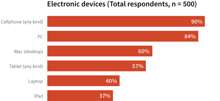
| Table 1 Electronic Devices Used | Total |
|---|---|
| PC | 421 (84%) |
| Mac (desktop) | 300 (60%) |
| Tablet (any kind) | 285 (57%) |
| iPad | 185 (37%) |
| Laptop | 200 (40%) |
| Cell phone (any kind) | 450 (90%) |
You may notice that the total number of responses (1,841) is greater than the number of people that did the survey (N=500)! Why? It’s because of the whole “a checkbox is really a bunch of yes/no questions rolled into one” thing. The total possible number of checked boxes in a checkbox question? It’s the (# of “real” answer options) X (# of respondents). (Here, a “real” answer option means one that isn’t “None,” “N/A” or “Prefer not to Answer,” since selecting one of those options would prevent a person from choosing any other answers in additional to that.) For this survey, there were 6 device options (aside from “None”) that a person could select and there were 500 people that answered the survey. So the total number of boxes that had the potential to get checked during the survey was 3000, not just 500.
Displaying Your Results
Since the total number of responses is greater than the number of respondents, you need to use some caution when creating graphs based on these data. There are a few different ways to illustrate your results, depending on what your overall question of interest is.
Bar Charts
One way is to construct a bar graph and base the percentages on the number of respondents that selected each answer choice, like in the graph below. Clearly, cellphones (90%) and PCs (84%) are the most commonly-cited electronic devices used in the past six months.
However, the fact that the total adds to more than 100% can be unsettling for some. An alternative way to illustrate the results is to base the percentages on the total mentions (1,841). Analyzing results based on mentions is useful when you want the percentages to total 100%.
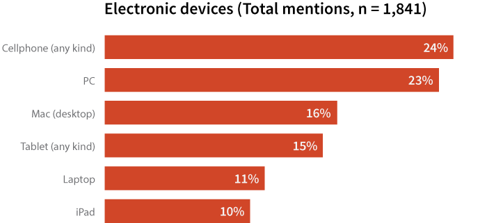
Keep in mind that this way of displaying data is based on the number of mentions of a device, not the number of consumers who use that device. While you may be tempted to say, “24% of consumers used a cellphone in the past six months,” the bar chart above isn’t actually displaying that information.
Rather than the number of respondents (500), the chart shows the number of responses (1,841) to our survey on electronic devices. So, it would be better to say, “Based on all devices mentioned, cellphones were mentioned approximately one-quarter (24%) of the time, followed closely by PCs (23%).” This percentage represents the number of cellphone mentions (450) out of the total mentions (1,841) and accurately reflects the information on display.
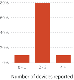
Depending on your question of interest, you can also group your data. Maybe you’re more interested in reporting how many devices people used rather than exactly what devices were. You could make a column chart like the one below.
Warning about pie charts and checkbox questions
Don’t use pie charts if you’re basing your percentages on the number of respondents that selected each answer choice! Pie charts are used to represent part-to-whole relationships and the total percentage of all the groups has to equal 100%. Since the possible sum of the percentages is greater than 100% when you base these calculations on the number of respondents, pie charts are an incorrect choice for displaying these results.
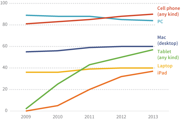
Over Time
If your checkbox responses have been collected over a period of time, say 2009–2013, you could display the responses in a line chart as shown below.
Attitudinal Measurements
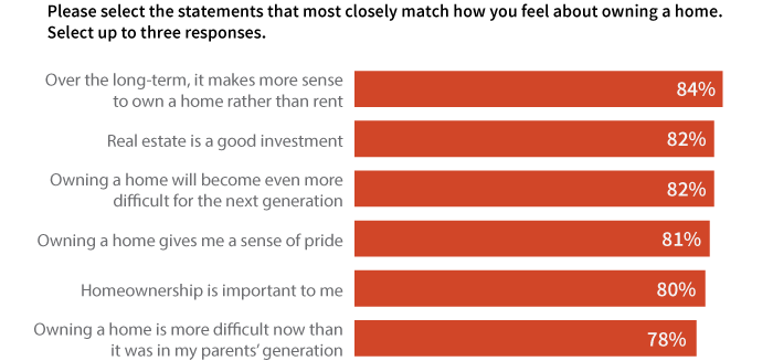
So far, we’ve been looking at the use of checkbox questions to gather data on basic counts (e.g. electronic devices used). Checkbox responses can also be used to assess agreement with attitudinal statements. The graph below shows attitudes of homeowners towards owning their home. In this case, since the statistic of interest is what percentage of homeowners agree with each statement, it is probably best to keep the graph as is, with the total exceeding 100%.