
Chapter 16
Print Vs. Web, Static Vs. Interactive
By Sarah Rigdon
Whether you’re designing graphics for static environments or for interactive ones, it’s important to address a few key things up front. First of all, what do we mean by static and interactive?
Defining Print Vs. Web; Static Vs. Interactive
You can design static graphics for print, the web, or both. With static graphics, you’ll provide everything you want your viewers to see without requiring any input from them. The most a static image demands from a viewer is to turn a page or scroll or perhaps enlarge an image. Typically, static graphics display information that isn’t subject to change.
You can also design interactive graphics for print or the web or both. Interactive graphics typically provide viewers with the option to dive deeper into the information, often requiring some degree of input. Now, you may be thinking, “Interactive print?” Actually, yes, though of course it’s not as common as interactive graphics on the web. Some examples include:
- Interactive projects
- Art installations
- Flip books/analog animations
- Popup books
So, static isn’t a stand-in for print, nor is interactive a stand-in for web.
One more thing: the antonym to static isn’t interactive. It’s changing, moving, or dynamic. Motion graphics don’t require viewer interaction, but they’re not static, either. Any given cable news network will give you examples of these. Do they display necessary information? Not usually. Adding motion to infographics can keep viewers’ attention, at least at first. But over the course of a segment or a show, viewer fatigue sets in. Motion graphics often look impressive, but you should always ask whether motion is necessary for conveying the information and be wary of overusing it.
Now let’s shift gears and talk about some of the core design concepts you should consider when creating static and interactive print-based and web-based graphics.
Color
As for color, there are a lot of questions to take into consideration before you break out your palette, especially if you’re working in print. Are you working with full color or black and white? If you’re working with color, consider what you’re gaining that makes it worth the cost difference from black and white. After all, grayscale and two-tone printing can still communicate a lot of information. Is a full-color print job really necessary?
How many colors are available for the print job? What kind of paper are you working with? Colors work differently with news print, magazine, and printer paper. Or are you getting fancy and putting the graphic on merchandise? A good merchandising company will work with you to make sure your t-shirts, totes, buttons, or stickers look great, but you’ll want to anticipate these concerns in advance.
On the web, a lot of these restrictions go away, but not all. Many designers have to work within a website’s color palette. They have to ask questions such as: does the website’s green color scheme completely clash with this bright pink graphic? Does it subtly complement the branding and logo design? The answers to each of these can have an impact on how the viewer receives the final design.
Size
Step back and take a look at the space you’re working with. You have to consider size for both print and the web.
With print, you have the page size constraining your graphics, but that can also be a blessing because you only need to design for a single width and height.
On the web, you can often include image-zooming functionality or allow viewers to open a larger version of a graphic in a separate browser tab, but you should consider the effects that zooming and scrolling can have on a user’s experience. A well-designed graphic should provide key information in a clear and elegant manner with minimum effort required by the user.
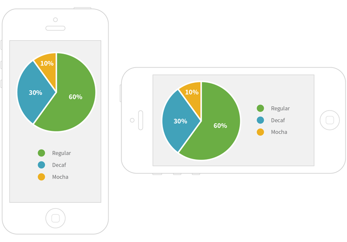
Mobile devices are also a concern, as more people are using cell phones and tablets to browse the web. Keep in mind that nearly two-thirds of cell-phone owners now use their phones to browse the web, and twenty percent use their phones to do most of their web browsing.6 It’s hard to see a lot of detail on a tiny touchscreen, but you don’t want users to have to squint to understand your graphic! You could build a responsive graphic — one that automatically changes its layout according to the dimensions of the viewer’s screen size — or you could design a completely different graphic specifically for display on small mobile devices. Given the state of mobile web browsing trends, it’s something you should consider when publishing a visualization on the web.
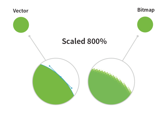
Many mobile devices (and increasingly, laptop and desktop monitors) have high-resolution displays, often referred to as retina displays. A static image designed at the standard web resolution of 72 dpi (dots per inch) will usually look blurry when viewed on a retina display. You’ll need to make double-resolution retina versions of your image-based graphics if you want them to look sharp on, say, a modern iPad. You can also create them using web fonts and SVGs, and they will always look crisp, no matter what the screen resolution. One downside to this is that some older browsers (notably Internet Explorer 8 and below) do not natively support SVG format.
What’s an SVG?
SVG stands for Scalable Vector Graphic: it’s a web-friendly format for displaying vector images—images that can scale to any dimension without pixellating by using mathematical expressions to draw paths. Vector images will look crisp even when blown up to very large sizes, unlike bitmap images (also known as raster graphics), which use bits of specific colors which are mapped to certain regions in the image. Bitmap images will look blurry when viewed at a high resolution, but they are often necessary when the color combinations are complex. A photograph is a great example of a bitmap image, and a simple circle is a great example of an image that can easily be drawn as a vector image.
Many of the tools for building web-based interactive charts and graphs (such as D3.js) use SVGs to render visualizations, especially interactive ones. Most of the static infographics, however, are published in bitmap image formats, such as JPEG or PNG.
Size doesn’t just refer to how big an image appears. Pay attention to the size of your file as well. People all around the world use mobile devices to browse the web. Not only can it take a long time to download a large image across a mobile network, but in some parts of the world, each megabyte of data is an added cost. Be nice to your viewers and work to reduce your final image size.
Layout
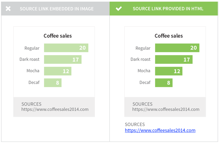
With static images, the point is to provide everything you want to convey in one or more frames. There are no mouseovers, you can’t click around and select certain details and un-select certain others (e.g., show only state rodeos from 1988 to 1996). Make sure that your key points are visible. If you’re creating a static version of an interactive graphic, keep in mind that you might not be able to show everything that was accessible in your original interactive graphic. If possible, provide URLs so that your readers can also access the raw data and the interactive version of your graphic. That way, they’ll have the option to dig deeper and find more information about the parts of the data that didn’t make it into the print version.
With interactive graphics, make sure to test any clickable controls that manage the interaction. Are there buttons or slides off to the side, or are they a part of the graphic? Does the viewer have to scroll around to see everything with several options engaged? Test your graphic in different browsers to make sure it all fits—and functions—the way you want.
A Note on Static Graphics on the Web
These aren’t necessarily interactive, save in that viewers can enlarge them. Because the graphic itself doesn’t change, the main considerations of layout still apply. But just by being on the web, static graphics give us more interactivity than print. For example, they can be linked to their data source, another related graph, or a different web page. Mobile screen sizes still remain a challenge for static graphics specifically because their layout doesn’t change to accommodate smaller screen real estates or different width-to-height ratios.

Although URLs displayed as part of a static image can’t be directly clicked on, it’s common for thoughtful publishers to paste reference links just below the graphic so that readers can easily access the source data.
Weighing the Need for Interactivity
Making interactive graphics is getting easier all the time with new software and applications. Interactivity can be not only extremely impressive but also useful, highlighting different types of information more effectively than a static image ever could. But sometimes, you’ll come across an interactive image that actually makes the information more confusing. Other times, you’ll come across an interactive image that seems neat at first, but as you play with it, you realize it’s just bells and whistles. You’re not learning anything new, and the information could just as clearly have been presented in a static image. What a let-down!
Why spend time making a graphic interactive when it doesn’t need it? Interactivity is a tool in the designer’s toolbox. Interactivity should be used when it improves upon a static graphic or adds value to the information and does something that the static image alone could not.
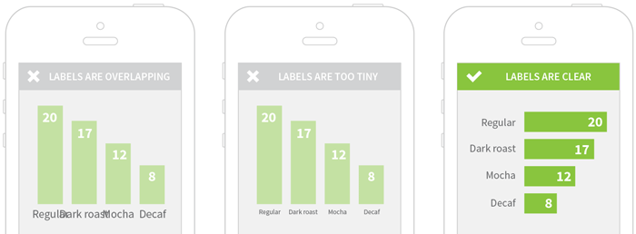
For example, consider the following bar chart:
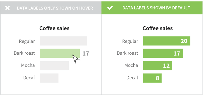
In the figure above, the interactive labels (e.g., the hover effects) aren’t necessary for the viewer’s comprehension. The labels can be added to the chart before hovering, which makes the chart easier to understand and requires less effort from the viewer. When you’re presenting a small, simple chart with a single variable, interactivity can actually detract from your message.
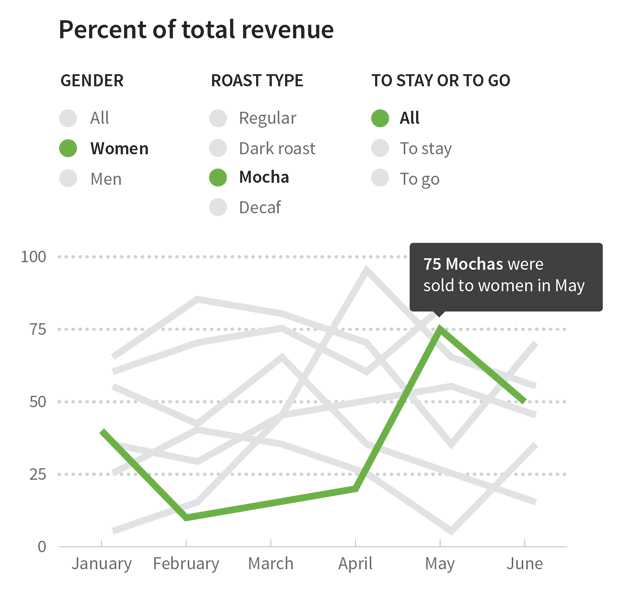
There are plenty of amazing use cases where interactivity adds value to a visualization, but you shouldn’t make yours interactive just because it looks cool. Make sure you’re actually improving the user’s experience. For example, interactivity can help greatly enhance any graphic that illustrates a rich data set you want the user to explore. Let’s say you want to show how different groups of consumers drink coffee. An interactive visualization might allow your user to filter by demographic groups and explore coffee consumption patterns.
Interactive graphics can add a lot of value when you have a rich dataset that you want the user to explore. For example, let’s say that you want to know how different groups of consumers drink coffee. An interactive visualization might allow you to filter by demographic groups and explore coffee consumption patterns.
In static graphics, you can’t rely on visual effects like movement or color changes to make your point. On the other hand, while interactive graphics can incorporate visual effects to show trends across time, they do introduce room for technical difficulties. Be mindful of compatibility across computer systems and browsers. Some of the more complex interactive visualizations require a lot of computational power and can be slow on less-powerful machines such as smart phones. Visualizations made using Flash won’t render on iPhones or iPads, and those made using SVGs won’t work in Internet Explorer 8 or below. Interactive visualizations built for a computer with a mouse may be difficult or impossible to use on touchscreen devices if the creator forgets to test and optimize the graphics for touch-based interactions.
Any medium for sharing a visualization — whether static or interactive — will have its strengths and its limitations. Think about your story, your audience, and how readers are likely to view your visualizations. Ask for feedback and continue to iterate on your process. And if you’re looking for some friendly feedback and suggestions, you can post your works-in-progress on HelpMeViz.