
Chapter 17
Perception Deception
By Mizel Djukic
With great power comes great responsibility.
So far you’ve picked up a bunch of tools you can use to build compelling stories through visualizations. If the story you tell is powerful enough, it can change people’s minds and move them to action. But before you rush out there to change the world with your newfound powers, let’s go over some of the accidents your visuals might cause because of the quirky way our brains perceive things.
How We Perceive Differences
Our brains love a difference. Even when we’re just relaxing in front of our computers watching cat videos and drinking iced tea, our brains are constantly looking for boundaries in our environment, differentiating between our feet and the floor, our hands and the keyboard, our cup and the table. How we perceive these boundaries depends on a variety of factors, including color, contrast, shape, and perspective.
Differences in Color and Contrast
When it comes to color and contrast, the example that probably comes to mind is black and white. It’s very easy for us to distinguish between the two because one is so dark and the other is so light. Varying the lightness and darkness of a color (known as the value) is one way to establish contrast, but it’s not the only way. You can also vary the saturation (or chroma) so that a color looks pale and faded or bright and vivid. Or you can establish contrast by simply using different colors (or hues) that are easy to tell apart from each other.
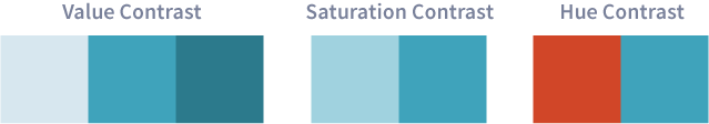
How our brains perceive contrast depends on the context. The higher the contrast between objects, the more different we think they are.7 For example, take a look at the following graph:
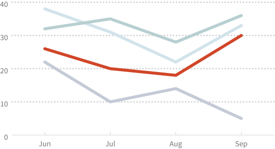
Anything stand out to you? Probably the red line, for a few reasons. First, the red line is more saturated than the other lines. Second, red and blue are good contrasting colors. Third, to our eyes, reds and yellows come to the foreground while blues recede to the background.8
Because of the high contrast between the red line and everything else, our brains will naturally focus on it, and we’ll probably think that there’s something special about the red line. Having the red line stand out like this is fine if there’s a good reason for doing so. For example, if each line represents the level of happiness over time in different neighborhoods, then the red line can highlight your neighborhood. However, if it turns out that there’s nothing special about the red line, then it winds up being distracting and confusing.
Now take a look at the following map which shows the level of excellence in different parts of a land called Relethounia:
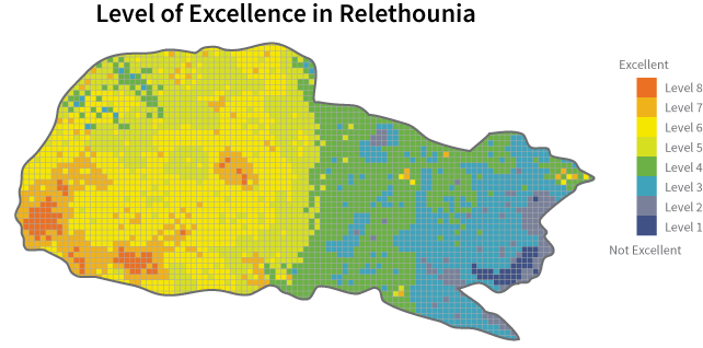
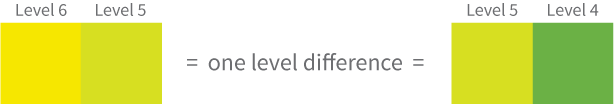
What stands out to you this time? Maybe that there seems to be some sort of division between the western and the eastern parts of the country? This apparent division is the result of the relatively high contrast between the light green and the dark green areas. So it seems like there’s a bigger difference between these two parts than between, for example, the yellow and the light green areas. But when we look at the legend, we see that the light green parts differ from the yellow and the dark green parts by the same amount: one level of excellence.
So be careful with color and contrast. When people see high contrast areas in your graphs, they’ll probably attach some importance to it or think there’s a larger difference, and you want to make sure your graphs meet that expectation.
Differences in Shape
Our brains have a much harder time telling the difference between shapes. To illustrate, see how long it takes you to find the red circle in each of the figures below:
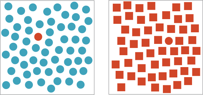
Adapted from: Healey, Christopher G., Kellogg S. Booth, and James T. Ennis. “High-Speed Visual Estimation Using Preattentive Processing.” ACM Transactions on Computer-Human Interaction 3.2 (1996): 4.
Did you find the circle faster in the first figure? Most of us do because our brains are better at differentiating between colors than between shapes. This is true even if some other factor is randomly changing and interferes with what we see.9 For example, see how long it takes you to find the boundary in each of the figures below:
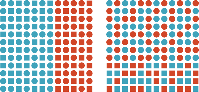
Adapted from: Healey, Christopher G., Kellogg S. Booth, and James T. Ennis. “High-Speed Visual Estimation Using Preattentive Processing.” ACM Transactions on Computer-Human Interaction 3.2 (1996): 5.
Most of us find the color boundary (between red and blue) in the left figure more quickly than the shape boundary (between circles and squares) in the right figure, even though both figures have another factor that’s randomly changing and interfering with our ability to detect the boundary. In the left image, the objects are organized by color while the shape is randomly changing. The reverse is true in the right image: the objects are organized by shape while the color is randomly changing.
All of this brings us to the question of whether or not it’s a good idea to use icons or pictograms in our visualizations because the simplest icons are defined by their form, not color. Luckily for us, the chapter on The Importance of Color, Font, and Icons offers some wisdom:
The rule should be: if you can make something clear in a small space without using an icon, don’t use an icon. […] As soon as anyone asks, “What does this icon mean?” you’ve lost the battle to make things ruthlessly simple.
Icons can be a clever and useful way to illustrate an idea while making your infographic more attractive, but in order to be effective, they have to strike the right balance between detail and clarity. Too much detail leads to icons that are hard to distinguish from each other; too little detail leads to icons that are too abstract. Both overcomplicated and oversimplified shapes can lead to a confused audience.
Now you be the judge. Good icons can communicate an idea without the benefit of color. Each of the three maps below shows the locations of hospitals and libraries in an area. Based solely on the icons, which map is the quickest and easiest for you to understand?
Differences in Perspective
We live in a 3-dimensional world with 3D movies, 3D printing, and 3D games. It can be very tempting to add some of this 3-dimensional razzle dazzle to your 2-dimensional visualizations. Most of the time, though, people end up more dazed than dazzled by 3D graphs.
As mentioned earlier, our brains already have a hard enough time distinguishing 2-dimensional shapes from each other. Adding a third dimension to these forms often adds to confusion as well. But don’t take our word for it. Which bar graph do you think is easier to read?
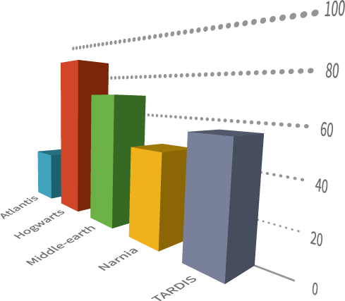
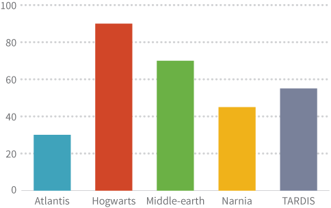
Harder-to-read graphs aren’t the only reason to avoid 3D in your visualizations. The other reason is that our brains associate differences in perspective with differences in size. You’ve probably experienced this phenomenon many times, whether you’re looking down a street or up at a skyscraper: objects in the foreground appear bigger while those in the background appear smaller.
For example, take a simple square table. You know that because it’s a square, all four sides are the same size. But when you look at it from the side:
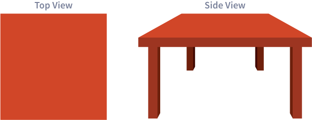
It seems like the side closer to you in the front is bigger than the side farther from you in the back.
For this reason, many types of 3D visualizations can be misleading. In the pie chart below, which slice do you think is bigger: the red slice or the green slice? the blue slice or the yellow slice?
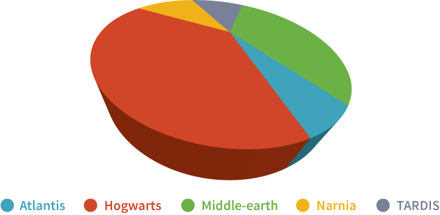
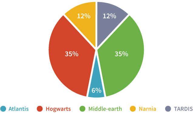
In terms of which piece represents more data, the red slice and the green slice are actually the same size. As for the blue and the yellow slices, the yellow slice is bigger: in fact, it’s twice as big as the blue slice. This is not clear from the 3D pie chart because of the way perspective distorts the size of the slices, but it is clear when we look at the same pie chart in 2D form:
So unless you have a really, really, really good reason to use 3D graphs, it’s better to avoid them. But just because 3D graphs aren’t great doesn’t mean 3D is bad in general. For example, 3D visualizations can be very useful in some types of scientific modeling, such as a 3-dimensional model of the brain that highlights active regions, or a 3-dimensional map that models the topography of an area. There are definitely instances when 3D enhances a visualization. Just make sure the 3D you add actually helps your audience see what you’re trying to show instead of getting in the way.
How We Compare Differences
So what have we learned so far? That our brains are pretty good at seeing differences in color and contrast, but less good at interpreting differences in shape and perspective. Generally speaking, it takes us longer to understand a data visualization when there are more differences to process. So help a brain out and minimize the differences! One way to do this is to be consistent in your graphs.
Consistent Alignment
Our brains are fairly good at comparing differences in length, but only when things share a common reference point.10 For example, try to compare how long the bars are in the following graph:
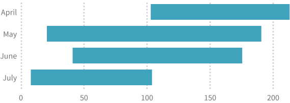
Now try to do the same thing for this graph:
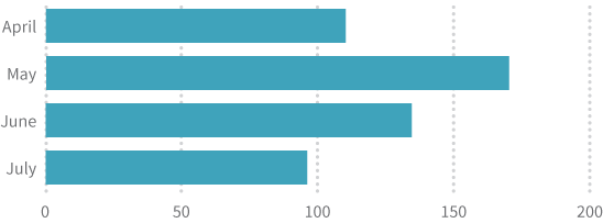
Wasn’t it easier to compare the bars in the second graph? Even though both bar graphs have a horizontal axis with labels and tick marks, the second graph minimizes the differences our brains have to process by making all of the bars start from the same reference point. Consistent alignment allows our brains to focus on the lengths without having to worry about different starting points for each bar.
Consistent Units
There may come a time when you want to show two sets of data in the same graph: something like a double line graph or a double bar graph, for instance. This is fine as long as you stick to the principle of consistency.
For example, the following bar graph compares how much it would cost to buy a few magical things in the United States versus the United Kingdom:
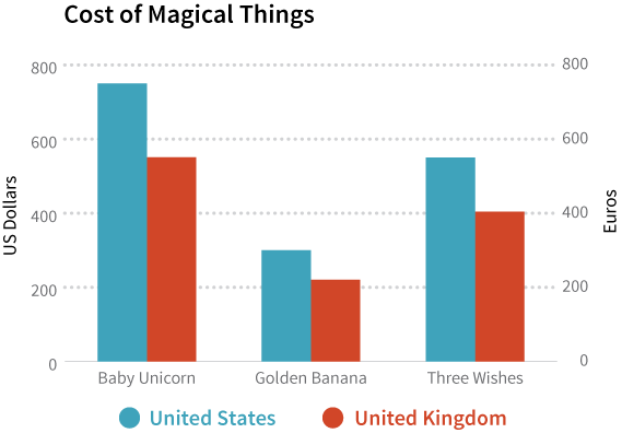
It seems like things are a bargain in the UK! But hold on because in this graph, it’s not enough to simply compare the bar lengths. There’s another difference we have to account for: the different units on the vertical axes. On the left side, the units are in US dollars. On the right side, the units are in euros. So in order to accurately compare prices, we need to either convert dollars to euros or euros to dollars. Some people can do this kind of currency conversion on the spot, and they are to be commended for their admirable math skills. The rest of us are going to look at that task and wonder why the maker of this bar graph is being so cruel to us. So don’t be cruel. Convert different units to consistent units so that your audience doesn’t have to. Like this:
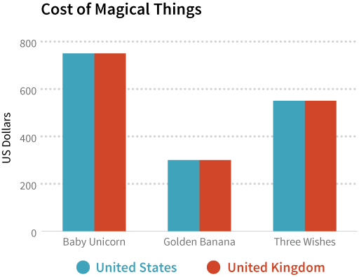
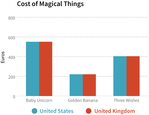
As it turns out, magical things cost the same in the US and the UK.
Consistent Scales
In addition to having consistent units, your graphs should have consistent scales. For example, the bar graph below compares how long it takes an Earthling and a Martian to master different superpowers:
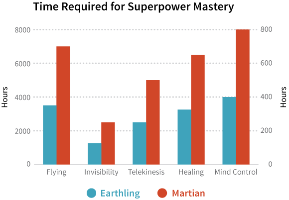
The heights of the bars make it seem like Martians take longer to master superpowers, but again, the vertical axes are different. Even though the units are consistent this time (both axes use hours), the scales are different. On the left side, the scale is in thousands of hours for Earthlings. On the right side, the scale is in hundreds of hours for Martians. The same data with consistent scales would look like this:
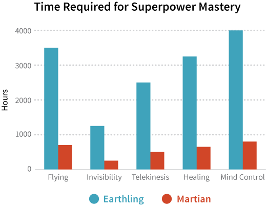
A graph with consistent scales makes it visually obvious that Martians master superpowers much more quickly than Earthlings do. Maybe it’s because they have less gravity on their planet.
Transparency
When it comes to data visualization and transparency, keep in mind that the data we show are just as important as the data we don’t. We want to give readers enough context and any other additional information they may need to accurately interpret our graphs.
Cumulative Graphs
A cumulative value tells you how much so far: it’s a total number that adds up as you go along. For example, let’s say you’re keeping track of how many superhero sightings there are in your neighborhood:
|
Month |
Number of Superhero Sightings |
Cumulative Number of Superhero Sightings |
|---|---|---|
| January | 60 | 60 |
| February | 40 | 100 = 60 + 40 |
| March | 38 | 138 = 60 + 40 + 38 |
| April | 30 | 168 = 60 + 40 + 38 + 30 |
| May | 25 | 193 = 60 + 40 + 38 + 30 + 25 |
| June | 26 | 219 = 60 + 40 + 38 + 30 + 25 + 26 |
| July | 20 | 239 = 60 + 40 + 38 + 30 + 25 + 26 + 20 |
| August | 18 | 257 = 60 + 40 + 38 + 30 + 25 + 26 + 20 + 18 |
| September | 30 | 287 = 60 + 40 + 38 + 30 + 25 + 26 + 20 + 18 + 30 |
| October | 62 | 349 = 60 + 40 + 38 + 30 + 25 + 26 + 20 + 18 + 30 + 62 |
| November | 75 | 424 = 60 + 40 + 38 + 30 + 25 + 26 + 20 + 18 + 30 + 62 + 75 |
| December | 90 | 514 = 60 + 40 + 38 + 30 + 25 + 26 + 20 + 18 + 30 + 62 + 75 + 90 |
The first column of values gives you the number of sightings in each month, independent of the other months. The second column gives you the number of sightings so far by adding the numbers as you go down the column. For example, in January there were 60 superhero sightings, so the total so far is 60. In February there were 40 sightings, which means the total so far is 100 because the 40 sightings in February get added to the 60 sightings in January. And so on and so forth for each month that follows.
Why are we doing all this math? Because there’s something called a cumulative graph, which shows cumulative values.
If you’re going to show people a cumulative graph, it’s important that you tell them it’s a cumulative graph.
Why? Because this is what a regular line graph of the monthly, non-cumulative values looks like:
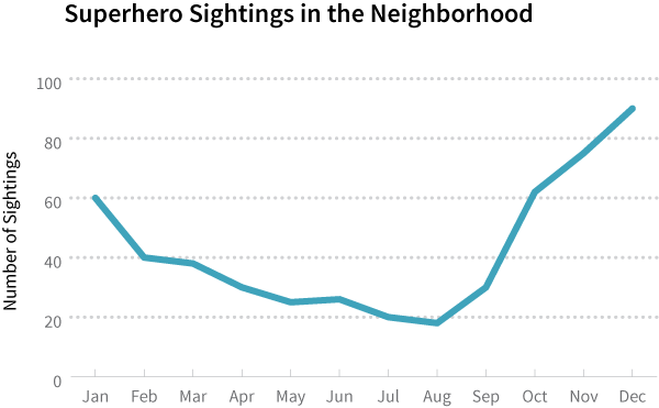
Notice how the line dips and rises: the number of monthly sightings generally decreases through August, then increases until the end of the year. Superheroes are apparently busier during the holiday months.
Compare the regular line graph above with the cumulative graph below:
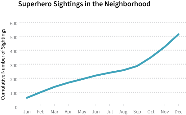
Do you see how the general decrease in superhero activity from January through August is not obvious in the cumulative graph? The line in the cumulative graph keeps going up because the numbers keep adding up and getting bigger. This upward trend masks other patterns in the data. It’s easy to look at a cumulative graph and mistakenly think it’s showing a trend that consistently increases when that’s not really the case.
So when it comes to cumulative graphs, if you show it, let them know it, or else people might think the numbers are going up, up, and away.
Context
Without context, the stories our graphs tell have no point of reference that we can use to make a comparison. For example, is the following trendline average or unusual?
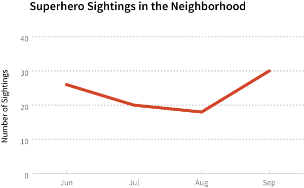
Alternatively, too much data can overwhelm an audience. In this case, the context gets lost among all the information and instead becomes an overcomplicated truth. For example, isn’t it harder to pick out the red trendline in the graph below?
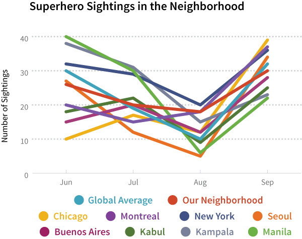
This is why data visualization is challenging! You have to figure out how to present your data in a way that allows readers to clearly see trends and accurately compare differences. For example, let’s take a look at the following graph:
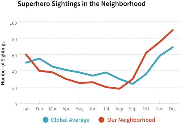
If you want to show your neighbors how the number of superhero sightings has changed over time, then presenting data that runs the course of a year instead of a few months provides more context. And instead of showing trendlines for dozens of cities around the world, your graph will be less cluttered and more relevant to your audience if you just show the trendline for your neighborhood. Finally, it’s a good idea to include some point of reference—like a trendline for the global average—so that your neighbors get a sense of how typical or atypical their neighborhood is.
The next and last chapter of this book goes into further detail about the importance of context and points out other ways graphics can mislead an audience. Just remember: being consistent and transparent goes a long way in your visualizations.