
Chapter 12
Deciding Which and How Much Data to Illustrate
By Margie Henry
Let’s lay some groundwork for successful data presentation. If done thoughtfully, it will go a long way in helping you determine which aspects of your data to visualize and how. We’ll begin with a little brainstorming. You can do this in just a few thoughtful moments alone or working as a team. Your work here is two-fold: define your message and define your intended audience. You can flip this sequence around, but we’ll begin with defining your message.
Determine Your Message
Before tackling which data to present, take a few minutes to decide what you want to say. Close down your latest social media craze, step back from your computer, and consider the exact message you want to communicate. Ask yourself, “What do I know, what does it mean, and why do I believe it’s important?”
Consider a dataset containing observations on different types of caffeinated beverages and the effects of their consumption. Don’t stop at “caffeine affects the body.” You never want to present information that solicits a “well, duh” response. Dig deeper. Be more specific. What do your data say about how caffeine affects the body? Are the effects all good, all bad, or maybe an interesting combination of both? Do the effects change with a person’s age and/or sex? Are some caffeinated beverages better or worse for overall health? Your answer should be concise: short, sweet, and to the point. A statement such as “Coffee has an ability to reduce the risk of certain diseases and ailments when consumed in moderation because it contains key antioxidants.” goes a lot further than our original example. Even better, it establishes a pretty clear focus for our visuals and some common language to use with our audience.
Right about now you should be having a flashback to English 101. That’s because determining your key message is just like writing a good thesis statement. If you can’t summarize your key message in a few concise sentences then you probably need a better grasp of the topic. Sound harsh? Maybe, but not as harsh as presenting information to a crowd of your yawning disinterested peers. Fight the urge to skip this step! If you’re the paper-and-pencil type, go ahead and write your message down! You can use it as a reference throughout your data visualization process.
Simply put, your chances of creating a compelling, well-organized visual argument are immeasurably greater if you begin with a clear and focused message.
Understand Your Audience
You’ve determined your message. Let’s now consider the importance of understanding your audience. This knowledge will go just as far in helping you determine which and how much of your data to illustrate.
Take another couple of minutes and ask yourself “what information is most valuable to my audience,” “what role will my visuals play in this dialogue,” and “what action(s) do I want to incite?” Would you spend time explaining algebra to a group of engineers? (The correct answer is no.) What would be the point? The better you know your audience, the better your chances of creating a successful visual presentation.
Let’s imagine presenting data on “Environmental Conservation in the New Millennium” in the following scenarios: (1) on a small-scale blog visited mostly by lay environmentalists; (2) in a classroom of high school students; and (3) at a fundraising event for an environmental conservation organization. Would you create and explain your data the same way to each audience? Hopefully not. You should be able to make a few assumptions about what’s most relevant to present even if you’ve never met a single audience member.
In our first scenario, we can assume visitors are already interested in conservation. They may have spent time doing actual research. A portion are return visitors who may rely on your specific perspective; they might see you as a content area expert. Your site is, most likely, not the only blog on which they rely, but one day it could be their favorite! At minimum, we can assume they’ve stumbled upon your blog intentionally, and not because of issues with autocomplete. In this instance, breadth and depth are key. You can take more time to explore, deconstruct and restructure the data. If the intention of your site is to incite further exploration, you can presents visuals that pose questions or make viewers question their own beliefs.
Our high school student scenario is a bit different. You can assume that your audience possesses very little familiarity with the topic. (Though, as always, some members will know more than others.) Attendance may be mandatory, not voluntary: keeping their interest will be key. You’ll want to present fascinating, high-level, attention-grabbing visuals, that address immediate and pressing issues. Approach your vocabulary carefully: explain less-common terminology, and include more visual indicators of good/bad, positive/negative. Your visual display is intended to clearly present the importance of conservation, leaving little room for doubt.
At last, we have our fundraiser attendees. This audience needs to feel that environmental conservation is a cause worthy of their monetary support. It will likely be a mixed crowd: interested donors, their disinterested partners (who just came for free food and drinks), field experts, employees, and interns. You can assume they’ll expect a balance of sentiment, the need for urgency, and solid fact. We’ve assumed the crowd is mixed, so you’ll want to use language that is both familiar and easily understood while not appearing condescending. This audience expects to have their interest in the importance of conservation confirmed and your visuals should accommodate this. As with your student group, leave no obvious question unanswered.
Presenting emotion-driven content doesn’t mean leaving out key facts if they don’t fit into your ideal storyline. Be extra careful when sharing cause-driven content, and do your best to ensure that your values don’t interfere with an accurate presentation of the data!
Now that we’ve discussed the importance of determining a key message and understanding its audience, let’s delve into deciding which data to illustrate.
Deciding Which Data to Illustrate
You can begin the process by expanding your key message into a narrative or story. Our goal is to present a sequence or set of facts which gradually leads your audience to the key message. The data you choose to illustrate should set the context, establish the main points of interest, and explain how these are interconnected. Be intentional in what you present, but do not censor data to further your argument. Your visual story should be based on what the data—and not only what you want to—say.
Take, for example, the following table presenting the I.Q. scores of children who were adopted at a young age and the socioeconomic status (based on income and occupation) of both their adoptive and birth parents. These data are taken from C. Capron and M. Duyme’s 1989 study, “Children’s IQs and SES of Biological and Adoptive Parents in a Balanced Cross-Fostering Study,” published in the European Bulletin of Cognitive Psychology.
| I.Q. | Adoptive Parent SES | Birth Parent SES |
|---|---|---|
| 136 | High | High |
| 99 | High | High |
| 121 | High | High |
| 133 | High | High |
| 125 | High | High |
| 131 | High | High |
| 103 | High | High |
| 115 | High | High |
| 116 | High | High |
| 117 | High | High |
| 94 | High | Low |
| 103 | High | Low |
| 99 | High | Low |
| 125 | High | Low |
| 111 | High | Low |
| 93 | High | Low |
| 101 | High | Low |
| 94 | High | Low |
| 125 | High | Low |
| 91 | High | Low |
| 98 | Low | High |
| 99 | Low | High |
| 91 | Low | High |
| 124 | Low | High |
| 100 | Low | High |
| 116 | Low | High |
| 113 | Low | High |
| 119 | Low | High |
| 92 | Low | Low |
| 91 | Low | Low |
| 98 | Low | Low |
| 83 | Low | Low |
| 99 | Low | Low |
| 68 | Low | Low |
| 76 | Low | Low |
| 115 | Low | Low |
| 86 | Low | Low |
| 116 | Low | Low |
Let’s discuss two possible narratives that you could create from this dataset: “Children’s Intelligence Limited by Adoptive Parents’ SES,” and “Adopted Children’s Intelligence Influenced by Both Biological And Adoptive Parents’ SES”.
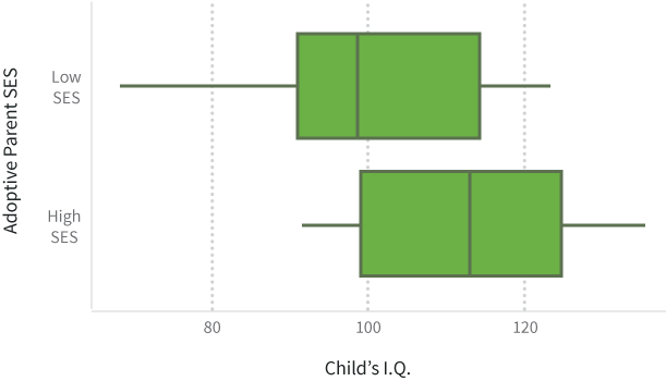
Children’s Intelligence Limited by Adoptive Parents’ SES
We can create a story supporting the first message by solely looking at the adoptive parents’ socioeconomic status: children of those adoptive families with a high SES had a mean I.Q. of nearly 112 whereas those adopted by a low SES family had a mean I.Q. of 99. But, this narrative would only include half of the relevant information: it leaves out entirely the SES of the child’s biological parents. Understandably, this could play just as big a role as the family’s socioeconomic status would likely impact the level and quality of prenatal care, and, in turn, the in utero development of the child.
Adopted Children’s Intelligence Influenced by Both Biological And Adoptive Parents’ SES
A little more boring of a title, but far more accurate. When we include both the adoptive and biological parents’ SES we get a much better picture of the impact that each has on the child’s I.Q. Specifically, we see:
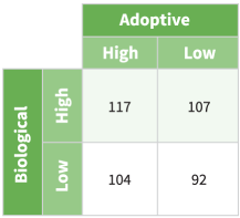
So, more correctly, a child’s I.Q. is a function of both his or her biological and adoptive parents’ socioeconomic status. If both have a high SES, the child’s I.Q. will tend to be the highest. If one has a high SES and the other a low SES (it doesn’t matter which set of parents has which), the child will typically have an average I.Q. And finally, if both have a low SES, the child will tend to have a below-average I.Q.
Our first example is a clear illustration of what happens when you create a story based on what you want to say, and not what the data say. Unfortunately, applications of data such as this are neither uncommon nor farfetched. We see this done on the news and during casual conversation. The omission of key facts and related variables creates a visual that is full of misinformation. It lacks credibility and presents obvious biases. The second instance presents far less outright bias, is a plausible story based on the data available, presents context, introduces all variables, and explains how the variables are connected. Although it will usually result in a less-sensationalized title, a full presentation of all relevant data is the only way to maintain a credible and airtight argument.
Deciding How Much Data to Illustrate
In previous sections we’ve gone over how to determine a key message, the importance of identifying the audience, and a process for isolating facts to illustrate. We can work on determining how much of our data we need to visualize.
If illustrating data is supposed to make information more digestible, then care should be taken not to present more than the audience expects, or more than they need to be able to understand your message. As you decide how much data to illustrate, keep in mind the idea that more is not always synonymous with better unless it’s meaningful and presented in support of your key message. In most instances, your visuals will be taken as part of a narrative, contents in a storehouse, or maybe a combination of both.
As previously discussed, a narrative is a simply a story presenting a sequence of facts which gradually lead your audience to the key message. When you think of the narrative, think of written reports, PowerPoint presentations, and individual articles in newspapers and magazines or online. You want to illustrate just enough data for your audience to easily identify and understand your perspective without becoming exhausted. Each illustration should have a specific purpose. Avoid including visuals simply because they impress. As a test, try removing one or more illustrations or rearranging the presentation order. Does your narrative still make sense? Each illustration should stand alone, without too much verbal or written explanation, but if it doesn’t add to the audience’s understanding, it’s probably not needed.
For the audience members wanting more, you can always provide links or references to additional takes on your data along with detailed commentary to contextualize and further explain the information. If you’d like to impress a technically savvy audience, a graphical appendix could be even be shared as a GitHub repository or a gallery of code gists hosted on bl.ocks.org.
A storehouse, on the other hand, can be thought of as an information repository. Usually consisting of multiple narratives and stand-alone content, this is an example of when more can be better. Unlike those of a narrative, storehouse visitors are less susceptible to data fatigue. They respond well to large quantities of data because they expect to spend time building or enhancing their understanding of a topic. The storehouse doesn’t need to focus on presenting a single message. Its audience seeks new treatments of data, a diversity of perspectives, and various dissections of a topic or content area. In the storehouse scenario, the main criterion for deciding how much data to illustrate should be whether something will create redundancy. If you illustration fails to add something new to the mix or to expand on a topic, it can likely be omitted.
To exemplify, let’s imagine a cinephile and store manager. Both are browsing a blog filled with upcoming movie release dates, reviews, and critiques of directors. The cinephile spends hours on the site, soaking up each and every visual and reading through its content. The manager simply wants to know what popular movies he should order for the next holiday season. The manager probably wouldn’t want to spend hours trying to find his answer. For our cinephile, more is better; for the manager, less is more.
Editing and Revising
Here’s a frequent and frustrating occurrence: you did your brainstorming, made a bunch of visualizations, and edited down to the best subset to include in your project. You were careful not to overwhelm your audience and you made sure that your illustrations covered the most important key points without being redundant.
How maddening, then, to field questions in a presentation, or see comments in a story or blog post, calling for the very visualizations that you left on the cutting room floor! You second-guess your calls, resist the urge to argue with the person asking the question, grit your teeth and grumble.
It’s okay. If you do a good job and engage your audience, they will naturally be curious and want more information. They might want to see the same data presented in a different way, to dig down, or to zoom out. If these questions mirror the decisions you were making in your selection process, that’s good news! It means you are on the same wavelength as your audience, and that they are involved and interested in the story your data tell.
There are several ways to keep (but de-emphasize) the visualizations that did not make the cut in your main collection. For slideshows, it is common practice to have a collection of extra slides after the “thank you” or conclusion slide that contain information that might be interesting but that won’t fit within the time limit. “Yes, I do have that broken down by [industry sector/year/country/gender],” you say confidently as you flip to the prepared slide. Voila!
Another way to do this would be to publish interactive versions of your visualizations that allow the viewers to dive in and explore the information themselves. If you’re able to share the raw datasets, that’s even better! That way, those who wish to dig deeper and understand the data in new ways will have the option to do so. We’ll talk more about static and interactive graphics later in the Print vs. Web chapter.
If you’re looking for early feedback and you’re not exactly sure where to turn, you can check out HelpMeViz, a community site where you can post your works-in-progress and receive friendly suggestions on how to improve. Getting feedback from your audience and revising your visuals to better fit their needs is all a part of the process!